A worldmap for applicants to the BVBD course at UofI
Maps!
Portfolio
DataViz
Final
IHHE
Author
Lucas
Published
June 5, 2025
Preamble
Since 2021, I have served on the advisory committee as a student representative at the Institute for Health in the Human Ecosystem (IHHE). During this time, I have witnessed the growing popularity of the Biology of Vector-borne Diseases (BVBD) course and a significant increase in the number of applicants over the years. Thus, a logical idea emerged (for which I must credit Dr. Barrie Robison) to visualize these data on a world map.
Institute for Health in the Human Ecosystem (IHHE) logo.
Here’s a description of the Biology of Vector-borne Diseases course that’s hosted at the University of Idaho every year, taken from the IHHE webpage:
“The Institute for Health in the Human Ecosystem hosts the annual Biology of Vector-borne Diseases six-day course. This course provides accessible, condensed training and”knowledge networking” for advanced graduate students, postdoctoral fellows, faculty and professionals to ensure competency in basic biology, current trends and developments, and practical knowledge for U.S. and global vector-borne diseases of plants, animals and humans. We seek to train the next generation of scientists and help working professionals to more effectively address current and emerging threats with holistic approaches and a strong network of collaborators and mentors.”
So, as part of the organizing advisory committee, we have been considering how to examine the evolution and popularity of the course applicants over the last six years. A suitable visualization would be a world map displaying the home countries of the applicants, year by year.
Data
The data set contains two variables. Year and Country. Year is the date when the course was offered, and Country is where the applicant is applying from, which in the end is used as spatial data. In the table below you can take a look at the data structure.
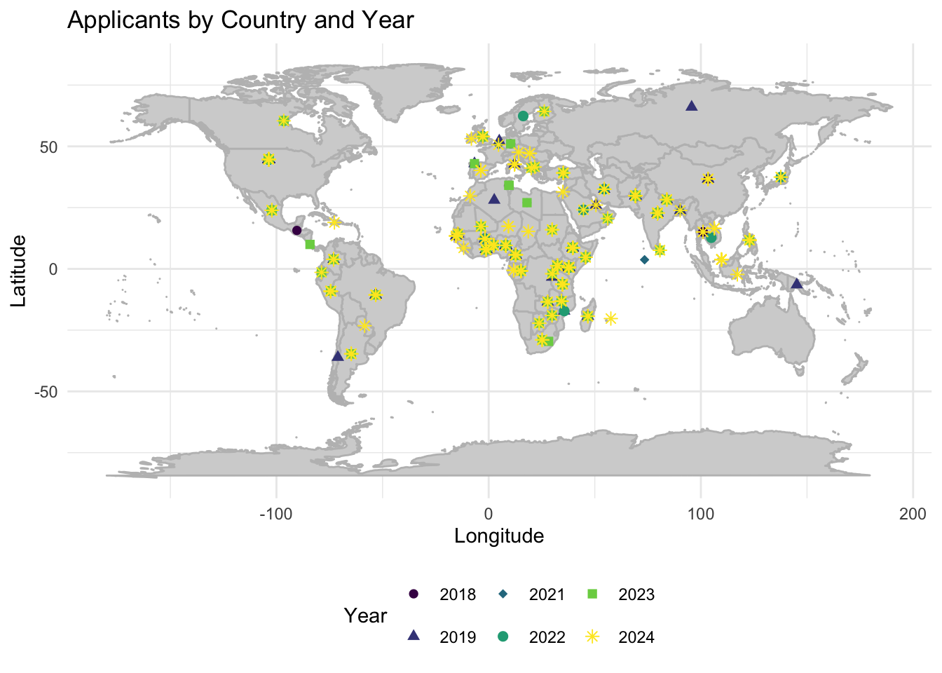
First, let’s start with simple maps. As we have simple data, without geometry/coordinates, it was necessary to convert Country data names into coordinates in order to plot them into the map.
Code
library(rnaturalearth)library(ggplot2)library(dplyr)library(sf)library(readxl) participants <- readxl::read_excel("BVBD Applicants Merged.xlsx")world <-ne_countries(scale ="medium", returnclass ="sf")world$centroid_lon <-st_coordinates(st_centroid(world$geometry))[, 1]world$centroid_lat <-st_coordinates(st_centroid(world$geometry))[, 2]participants_with_centroids <- participants %>%left_join(world %>%select(name, centroid_lon, centroid_lat), by =c("Country"="name"))ggplot(data = participants_with_centroids) +borders("world", colour ="gray", fill ="lightgray") +# Draw the base mapgeom_point(aes(x = centroid_lon, y = centroid_lat, color =as.factor(Year), shape =as.factor(Year)), size =2) +# Plot points with varying colors and shapes per Yearscale_color_viridis_d(name ="Year") +# Use a nice color scale for colorsscale_shape_manual(name ="Year", values =c(16, 17, 18, 19, 15, 8, 10)) +# Manually set shapes, adjust values as needed based on the number of yearstheme_minimal() +labs(title ="Applicants by Country and Year", x ="Longitude", y ="Latitude", color ="Year", shape ="Year") +theme(legend.position ="bottom")
Figure 1. Distribution of applicants by country and year.
Code
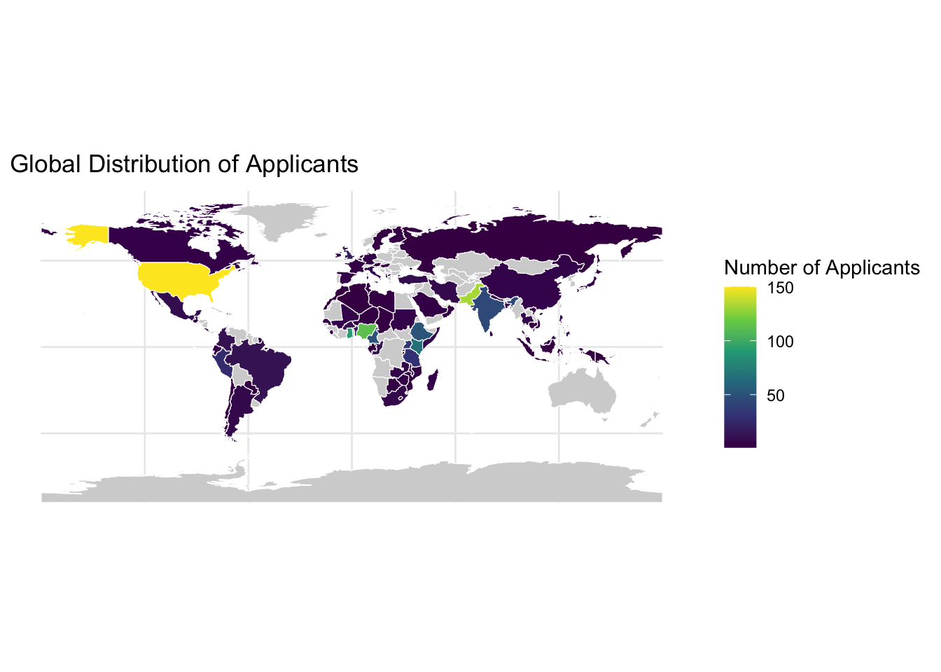
# Assuming 'participants' has a 'Country' column# Count the number of applicants per countryapplicants_summary <- participants %>%group_by(Country) %>%summarise(Applicants =n())# Join with world data to include geometryworld_with_applicants <- world %>%left_join(applicants_summary, by =c("name"="Country"))# Plot with a gradient fill based on the number of applicantsggplot(data = world_with_applicants) +geom_sf(aes(fill = Applicants), color ="white") +scale_fill_viridis_c(name ="Number of Applicants", na.value ="lightgrey", limits =c(1, 300), oob = scales::squish) +# Set the range from 1 to 150labs(title ="Global Distribution of Applicants") +theme_minimal()
Figure 2. Global distribution of applicants.
Figure 1 uses both colors and shapes, representing two different channels, to differentiate between years. However, there’s an issue of over-plotting that could be resolved by creating one map for each year. Figure 2 serves a different purpose; it displays the distribution of the total number of applicants over the six years that the course has been offered.
Ok, let’s try an interactive map, using the total number of applicants for the six years that the course has been offered. This map let us zoom in, see the name of each country and number of applicants per country.
Code
library(dplyr)library(sf)library(rnaturalearth)library(leaflet)library(viridis)library(readxl)participants <- readxl::read_excel("BVBD Applicants Merged.xlsx")# Count the number of applicants per countryapplicants_summary <- participants %>%group_by(Country) %>%summarise(Applicants =n()) %>%ungroup()# Get world countries' spatial dataworld <-ne_countries(scale ="medium", returnclass ="sf")# Merge applicants data with spatial dataworld_with_applicants <- world %>%left_join(applicants_summary, by =c("name"="Country"))# Assuming the majority of your data points are in the lower range (e.g., 1-10),# and you want to ensure these differences are visible, adjust the domain accordingly# Here, we manually define the domain to ensure the lower counts are differentiatedmin_applicants <-min(world_with_applicants$Applicants, na.rm =TRUE)max_applicants <-max(world_with_applicants$Applicants, na.rm =TRUE)# Define a color palette function based on the number of applicantsqpal <-colorNumeric(palette ="viridis", domain =c(min_applicants, max_applicants), na.color ="lightgrey")# Create the leaflet map with enhanced highlight functionalityleaflet(world_with_applicants) %>%addProviderTiles(providers$CartoDB.Positron) %>%addPolygons(fillColor =~qpal(Applicants),color ="#2b2b2b", # Default outline colorfillOpacity =0.7,weight =0.5, # Default outline weightpopup =~paste(name, "<br>", "Applicants: ", Applicants),highlightOptions =highlightOptions(weight =5, # Thicker outline when highlightedcolor ="#FFFF00", # Bright yellow outline when highlightedfillOpacity =0.7,bringToFront =TRUE)) %>%addLegend(pal = qpal, values =~Applicants,title ="Number of Applicants",position ="bottomright") %>%setView(lat =0, lng =0, zoom =2)
Figure 3. Interactive map of global distribution of applicants, with information per country.
Let’s dive even further. Let’s try a 3D world map.
Code
library(plotly)library(dplyr)library(countrycode)# Aggregating the number of applicants per countryapplicants_summary <- participants %>%group_by(Country) %>%summarise(Applicants =n()) %>%ungroup()# Adding ISO country codes to 'applicants_summary' for Plotlyapplicants_summary$CODE <-countrycode(applicants_summary$Country, "country.name", "iso3c")# Handling missing or incorrect country namesapplicants_summary <-na.omit(applicants_summary)# Specify map projection and optionsg <-list(showframe =FALSE,showcoastlines =FALSE,projection =list(type ='orthographic'),resolution ='100',showcountries =TRUE,countrycolor ='#d1d1d1',showocean =TRUE,oceancolor ='#c9d2e0',showlakes =TRUE,lakecolor ='#99c0db',showrivers =TRUE,rivercolor ='#99c0db')# Plotting with simplified tracep <-plot_geo(applicants_summary, locations =~CODE, text =~paste(Country, '<br>Applicants: ', Applicants),marker =list(size =~sqrt(Applicants) *2, color =~Applicants, colorscale ='Reds', line =list(color ="#d1d1d1", width =0.5))) %>%colorbar(title ='Number of Applicants') %>%layout(title ='Number of Applicants Per Country', geo = g)p
Figure 4. Interactive map (3D) of global distribution of applicants, per country.
Conclusions
The type of visualization certainly depends on the purpose it is going to serve. For example, Figures 1 and 2 are best suited for a publication or poster, where interactivity is not possible. For a webpage, Figures 3 and 4 are more appealing and draw more attention from the viewer, enabling the possibility to examine specific countries with precise data presented upon request.
Source Code
---title: "Final Project"subtitle: "A worldmap for applicants to the BVBD course at UofI"format: html: warning: false toc: false echo: trueauthor: "Lucas"date: "2025-06-05"categories: [Portfolio, DataViz, Final, IHHE]image: "ihhe.png"description: "Maps!"code-fold: truecode-tools: true---# **Preamble**Since 2021, I have served on the advisory committee as a student representative at the **Institute for Health in the Human Ecosystem (IHHE)**. During this time, I have witnessed the growing popularity of the **Biology of Vector-borne Diseases (BVBD)** course and a significant increase in the number of applicants over the years. Thus, a logical idea emerged (for which I must credit Dr. Barrie Robison) to visualize these data on a world map.{fig-align="center" width="300"}Here's a description of the Biology of Vector-borne Diseases course that's hosted at the University of Idaho every year, taken from the IHHE webpage:"The Institute for Health in the Human Ecosystem hosts the annual Biology of Vector-borne Diseases six-day course. This course provides accessible, condensed training and "knowledge networking" for advanced graduate students, postdoctoral fellows, faculty and professionals to ensure competency in basic biology, current trends and developments, and practical knowledge for U.S. and global vector-borne diseases of plants, animals and humans. We seek to train the next generation of scientists and help working professionals to more effectively address current and emerging threats with holistic approaches and a strong network of collaborators and mentors."Here's a link to the IHHE website:<https://www.uidaho.edu/research/entities/ihhe/education/vector-borne-diseases>So, as part of the organizing advisory committee, we have been considering how to examine the evolution and popularity of the course applicants over the last six years. **A suitable visualization would be a world map displaying the home countries of the applicants, year by year**.# **Data**The data set contains two variables. **Year** and **Country**. **Year** is the date when the course was offered, and **Country** is where the applicant is applying from, which in the end is used as spatial data. In the table below you can take a look at the data structure.```{r}library(readxl)library(dplyr)library(knitr)participants <- readxl::read_excel("BVBD Applicants Merged.xlsx")knitr::kable(head(participants))```# VisualizationsFirst, let's start with simple maps. As we have simple data, without geometry/coordinates, it was necessary to convert **Country data names into coordinates** in order to plot them into the map.```{r}library(rnaturalearth)library(ggplot2)library(dplyr)library(sf)library(readxl) participants <- readxl::read_excel("BVBD Applicants Merged.xlsx")world <-ne_countries(scale ="medium", returnclass ="sf")world$centroid_lon <-st_coordinates(st_centroid(world$geometry))[, 1]world$centroid_lat <-st_coordinates(st_centroid(world$geometry))[, 2]participants_with_centroids <- participants %>%left_join(world %>%select(name, centroid_lon, centroid_lat), by =c("Country"="name"))ggplot(data = participants_with_centroids) +borders("world", colour ="gray", fill ="lightgray") +# Draw the base mapgeom_point(aes(x = centroid_lon, y = centroid_lat, color =as.factor(Year), shape =as.factor(Year)), size =2) +# Plot points with varying colors and shapes per Yearscale_color_viridis_d(name ="Year") +# Use a nice color scale for colorsscale_shape_manual(name ="Year", values =c(16, 17, 18, 19, 15, 8, 10)) +# Manually set shapes, adjust values as needed based on the number of yearstheme_minimal() +labs(title ="Applicants by Country and Year", x ="Longitude", y ="Latitude", color ="Year", shape ="Year") +theme(legend.position ="bottom")```**Figure 1.** Distribution of applicants by country and year.```{r}# Assuming 'participants' has a 'Country' column# Count the number of applicants per countryapplicants_summary <- participants %>%group_by(Country) %>%summarise(Applicants =n())# Join with world data to include geometryworld_with_applicants <- world %>%left_join(applicants_summary, by =c("name"="Country"))# Plot with a gradient fill based on the number of applicantsggplot(data = world_with_applicants) +geom_sf(aes(fill = Applicants), color ="white") +scale_fill_viridis_c(name ="Number of Applicants", na.value ="lightgrey", limits =c(1, 300), oob = scales::squish) +# Set the range from 1 to 150labs(title ="Global Distribution of Applicants") +theme_minimal()```**Figure 2.** Global distribution of applicants.**Figure 1** uses both colors and shapes, representing two different channels, to differentiate between years. However, there’s an issue of over-plotting that could be resolved by creating one map for each year. **Figure 2** serves a different purpose; it displays the distribution of the total number of applicants over the six years that the course has been offered.Ok, let’s try **an interactive map**, using the total number of applicants for the six years that the course has been offered. This map let us zoom in, see the name of each country and number of applicants per country.```{r}library(dplyr)library(sf)library(rnaturalearth)library(leaflet)library(viridis)library(readxl)participants <- readxl::read_excel("BVBD Applicants Merged.xlsx")# Count the number of applicants per countryapplicants_summary <- participants %>%group_by(Country) %>%summarise(Applicants =n()) %>%ungroup()# Get world countries' spatial dataworld <-ne_countries(scale ="medium", returnclass ="sf")# Merge applicants data with spatial dataworld_with_applicants <- world %>%left_join(applicants_summary, by =c("name"="Country"))# Assuming the majority of your data points are in the lower range (e.g., 1-10),# and you want to ensure these differences are visible, adjust the domain accordingly# Here, we manually define the domain to ensure the lower counts are differentiatedmin_applicants <-min(world_with_applicants$Applicants, na.rm =TRUE)max_applicants <-max(world_with_applicants$Applicants, na.rm =TRUE)# Define a color palette function based on the number of applicantsqpal <-colorNumeric(palette ="viridis", domain =c(min_applicants, max_applicants), na.color ="lightgrey")# Create the leaflet map with enhanced highlight functionalityleaflet(world_with_applicants) %>%addProviderTiles(providers$CartoDB.Positron) %>%addPolygons(fillColor =~qpal(Applicants),color ="#2b2b2b", # Default outline colorfillOpacity =0.7,weight =0.5, # Default outline weightpopup =~paste(name, "<br>", "Applicants: ", Applicants),highlightOptions =highlightOptions(weight =5, # Thicker outline when highlightedcolor ="#FFFF00", # Bright yellow outline when highlightedfillOpacity =0.7,bringToFront =TRUE)) %>%addLegend(pal = qpal, values =~Applicants,title ="Number of Applicants",position ="bottomright") %>%setView(lat =0, lng =0, zoom =2)```**Figure 3.** Interactive map of global distribution of applicants, with information per country.Let's dive even further. Let's try a **3D world map.**```{r}library(plotly)library(dplyr)library(countrycode)# Aggregating the number of applicants per countryapplicants_summary <- participants %>%group_by(Country) %>%summarise(Applicants =n()) %>%ungroup()# Adding ISO country codes to 'applicants_summary' for Plotlyapplicants_summary$CODE <-countrycode(applicants_summary$Country, "country.name", "iso3c")# Handling missing or incorrect country namesapplicants_summary <-na.omit(applicants_summary)# Specify map projection and optionsg <-list(showframe =FALSE,showcoastlines =FALSE,projection =list(type ='orthographic'),resolution ='100',showcountries =TRUE,countrycolor ='#d1d1d1',showocean =TRUE,oceancolor ='#c9d2e0',showlakes =TRUE,lakecolor ='#99c0db',showrivers =TRUE,rivercolor ='#99c0db')# Plotting with simplified tracep <-plot_geo(applicants_summary, locations =~CODE, text =~paste(Country, '<br>Applicants: ', Applicants),marker =list(size =~sqrt(Applicants) *2, color =~Applicants, colorscale ='Reds', line =list(color ="#d1d1d1", width =0.5))) %>%colorbar(title ='Number of Applicants') %>%layout(title ='Number of Applicants Per Country', geo = g)p```**Figure 4.** Interactive map (3D) of global distribution of applicants, per country.# **Conclusions**The type of visualization certainly depends on the purpose it is going to serve. For example, Figures 1 and 2 are best suited for a publication or poster, where interactivity is not possible. For a webpage, Figures 3 and 4 are more appealing and draw more attention from the viewer, enabling the possibility to examine specific countries with precise data presented upon request.